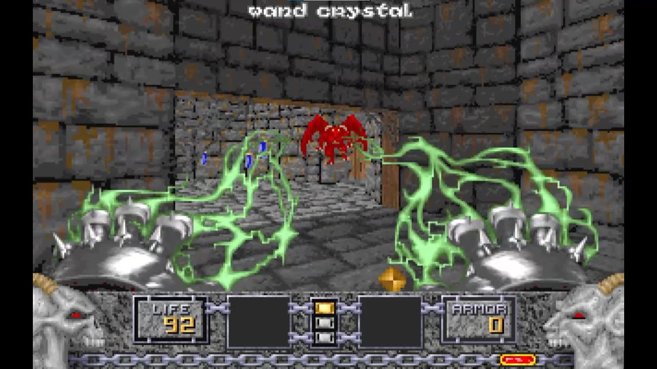
DOOM
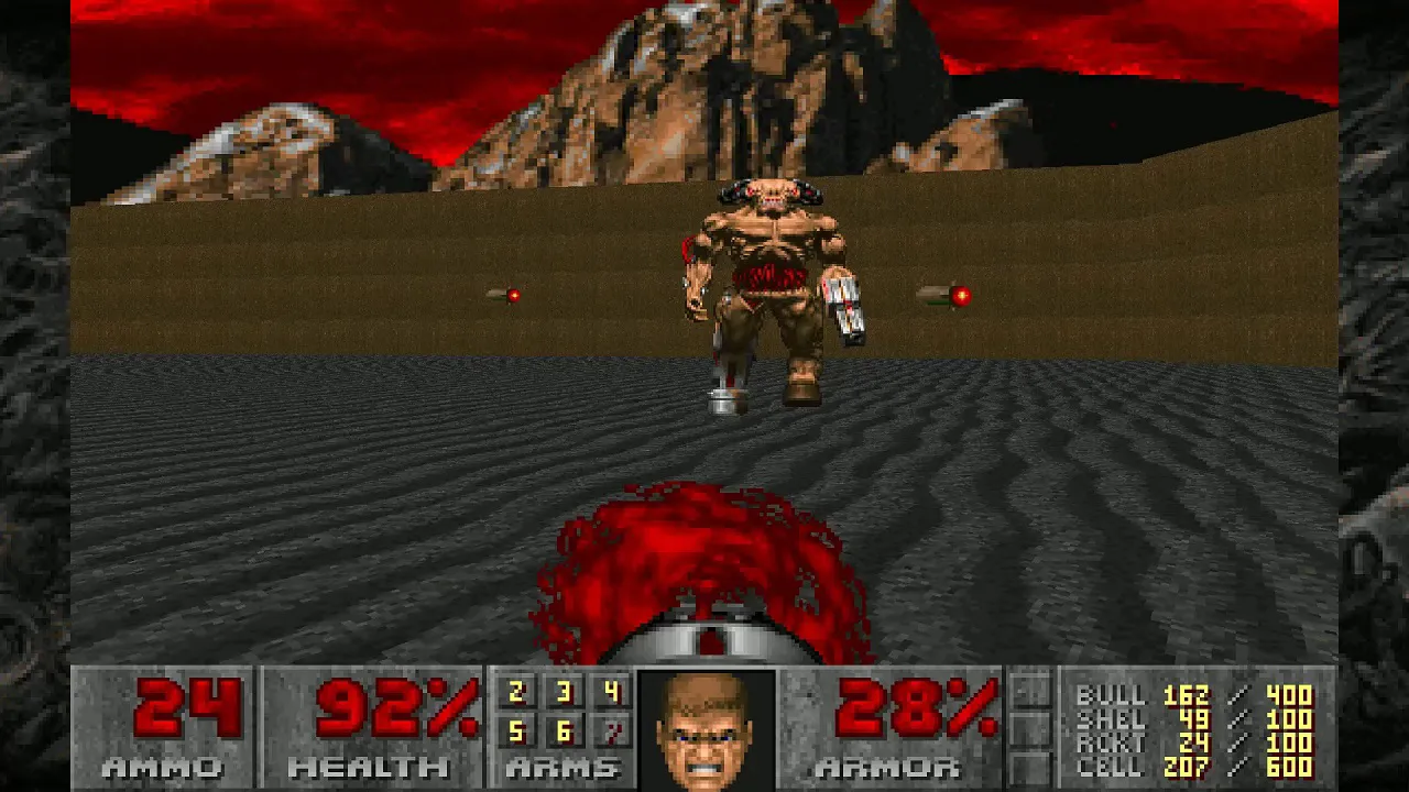
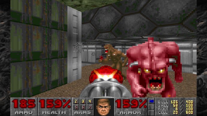
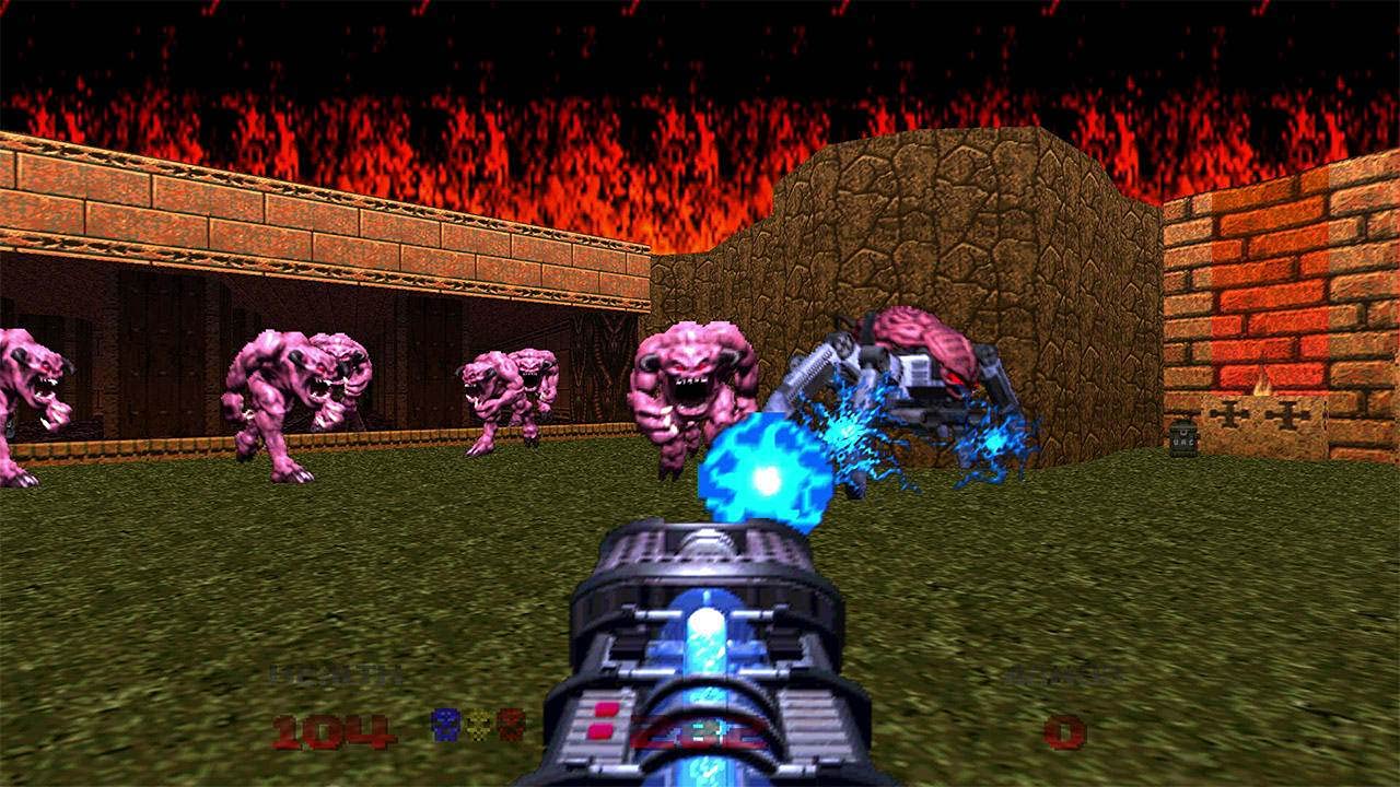
In DOOM (1993), developed by id Software, the user interface showcases elements that, while primarily non-diegetic by modern definitions, include a compelling example of diegetic design through the character portrait, bridging a hybrid approach to UI. Most of the game’s interface elements—such as the ammo count, health, and armor values—are rendered as an on-screen HUD overlay, typical of early FPS design. However, the facial portrait of the Doomguy, centrally located at the bottom of the screen, functions as a diegetic element by visually conveying the player character’s physical and emotional state in real time.
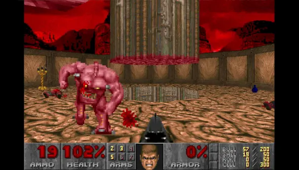
This animated avatar reflects increasing damage with visible bruising, bleeding, and expressions of pain or rage, offering visual feedback without reliance on abstract indicators alone. It is an early example of character embodiment through UI, subtly strengthening player-avatar identification and narrative immersion despite the absence of voice or textual introspection. While the portrait exists within the HUD, its behavior is contextually reactive and aligned with the internal world of the character, making it a quasi-diegetic element in UX terms.
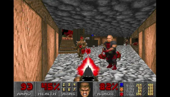
Additionally, the weapon visible in the center of the screen is rendered in the 3D space and moves with player actions, another diegetic cue that supports spatial coherence and contributes to the immersive qualities of the game. This tactile alignment between the UI and in-game action was influential in shaping FPS conventions, proving how minimal diegetic elements, when thoughtfully implemented, can enhance user immersion and real-time feedback within fast-paced gameplay environments.
At the center of DOOM’s interface is the protagonist’s face — a small portrait that reacts to health changes, damage, and power-ups. This character-linked HUD element is a semi-diegetic component, as it visually communicates the avatar’s physical and emotional state without abstract bars alone. The grimaces, bleeding, and glances left and right create a subtle avatar feedback loop, enhancing player-avatar connection through expressive UI that echoes the character’s experience.
The UI features numerical health, armor, and ammo counters, presented in a clean and legible layout along the bottom of the screen. While these elements are non-diegetic, their spatial placement and integration with the character portrait form a consistent visual hierarchy. This approach reflects an early model of contextual HUD design, prioritizing real-time information delivery with minimal cognitive friction — ideal for fast-paced gameplay.
Much like Papers, Please or Far Cry 2, DOOM maintains real-time continuity by disallowing in-combat pausing for inventory or map checks. The player’s view is uninterrupted, maintaining spatial-temporal immersion. This UX decision increases tension and enhances the game’s signature flow state, where reflexes and spatial awareness are prioritized over planning or management.
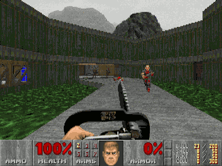
While the game lacks a diegetic minimap, players rely heavily on environmental readability — lighting cues, enemy sounds, door colors, and visual landmarks — to navigate complex levels. This promotes environmental cognition and strengthens spatial problem-solving. Doors, switches, and teleporters are all readable through intuitive, consistent visual language, compensating for the absence of traditional UI elements.
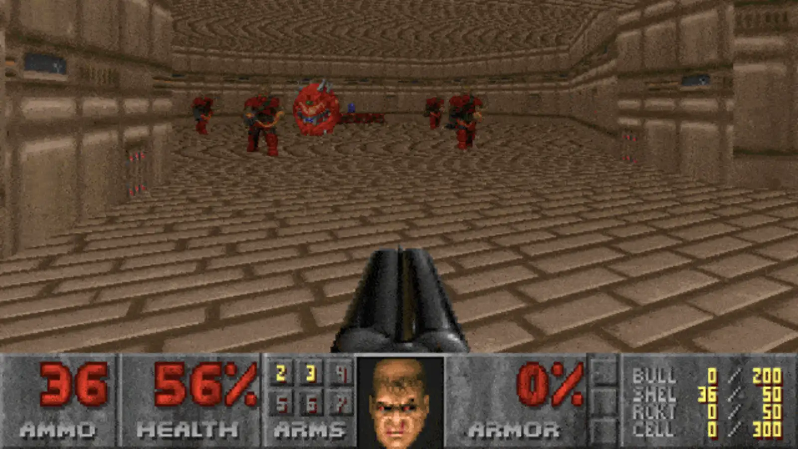


DOOM’s weapon system is a masterclass in embodied UI, where feedback is conveyed not through overlays or floating indicators but through audiovisual performance tightly coupled with the player’s actions. Each gun has a distinct cadence, recoil animation, and sound profile, forming a kind of kinesthetic language. There’s no need for extraneous UI to tell the player how powerful or effective a weapon is — the thundering blast of the shotgun or the charged hum of the plasma rifle feels impactful. This reinforces player intuition and allows weapon selection to become instinctive, not mediated by UI overlays or menus. The weapon sprites are also rendered in-world, taking up a physical presence in the bottom center of the screen, effectively doubling as both diegetic tools and expressive feedback mechanisms.
One of DOOM’s greatest UX triumphs is its disciplined restraint. The HUD delivers only what’s essential: health, armor, ammo, and keys. There are no quest markers, objectives lists, or tutorial prompts cluttering the screen. This deliberate minimalism keeps the player’s attention firmly rooted in the game world and action. Instead of managing systems, players are immersed in movement, reaction, and spatial engagement. By minimizing interface overhead, DOOM fosters what Mihaly Csikszentmihalyi described as the flow state — total immersion achieved through clarity of goals and unbroken concentration. The UI becomes an enabler of flow, not a layer of abstraction.
Sound in DOOM acts as a powerful diegetic interface layer. Roars, growls, and gunshots echo through corridors, giving players directional hints about enemy locations and movement without on-screen markers. The spatialized audio plays a dual role — enhancing atmosphere while functioning as a navigational and threat-awareness tool. This design choice turns environmental audio into actionable feedback, sharpening player reflexes and heightening anticipation. The absence of visual alerts forces players to listen as much as they look, deepening the sensory feedback loop.
Even without a diegetic minimap or compass, DOOM excels in using level architecture as an interface for navigation. Verticality, sightlines, door colors, and switch mechanisms create a visual logic that teaches players how to read the environment as a system. Brightly colored keycards correspond to locked doors with matching hues, forming an intuitive visual grammar. Secret areas are often hinted at through subtle texture misalignments or suspicious wall symmetry — a level design approach that transforms exploration into a form of pattern recognition. In this way, the game world is the interface, guiding player behavior through design, not directives.
The weapon-switching system is functional but lacks diegetic grounding. There’s no visual representation of the character physically interacting with weapons (e.g., reloading or holstering), which breaks player-avatar embodiment. A more physicalized system — like weapon animations or a visual inventory — could have enhanced narrative realism without slowing gameplay.
The stark contrast and pixelated font, while iconic, can be hard to read for modern players or those with visual impairments. The game lacks accessibility affordances such as scalable UI, colorblind modes, or alternative contrast settings. Additionally, sound cues (like enemy roars or item pickups) are not always spatialized, limiting audio feedback clarity.
While the central face portrait offers some expressive feedback, other UI elements (like ammo or health) remain static, numeric values. There is little emotive or sensory feedback — such as controller vibrations or screen effects — to reinforce damage or power-up impacts. This limits multimodal feedback, which modern games often leverage to deepen immersion.
The game intentionally omits objective markers or directional hints, favoring exploration and memory. While this supports player agency, it can also cause navigational friction, especially in later levels where design complexity increases. This approach may challenge players unfamiliar with non-linear level design paradigms typical of early '90s shooters.
"We wanted to make the most fun game ever."
"Initial versions also retained 'arcade' elements present in Wolfenstein 3D, like score points and score items, but those were removed early in development as they felt unrealistic and not in keeping with the tone. Other elements, such as a complex user interface, an inventory system, a secondary shield protection, and lives were modified and slowly removed over the course of development."
"Beginning with Doom v0.2, the earliest concept for a HUD appears in the form of a complex view from inside the Doom marine's helmet. This view included (non-functional) health, armor, and shield meters; ammunition read-outs for each weapon; a display of statistics for the current weapon in use; a player inventory listing; an on-screen automap; and an area for text messages or dialogue."
"Doom gives clear, unambiguous, quick feedback to the player. That is one of the fundamental requirements of good interactive design."
"Doom (1993) has some of the best controls I have ever experienced in a video game. The controls are comfortable and feature zero input lag."
"Doom's level design was very original and beautiful... The game's textures are weird and in many cases disturbing, some of them are miniature works of art."
"The enemy sprites are also far too pixilated; it looks like something from a Commodore 64. I mean, get close to an enemy. It looks like a big pile of colors that's just thrown all over your screen."