Dead Space

Developer

Motive Studio

Year

2008

Breakdown

Diegetic UI

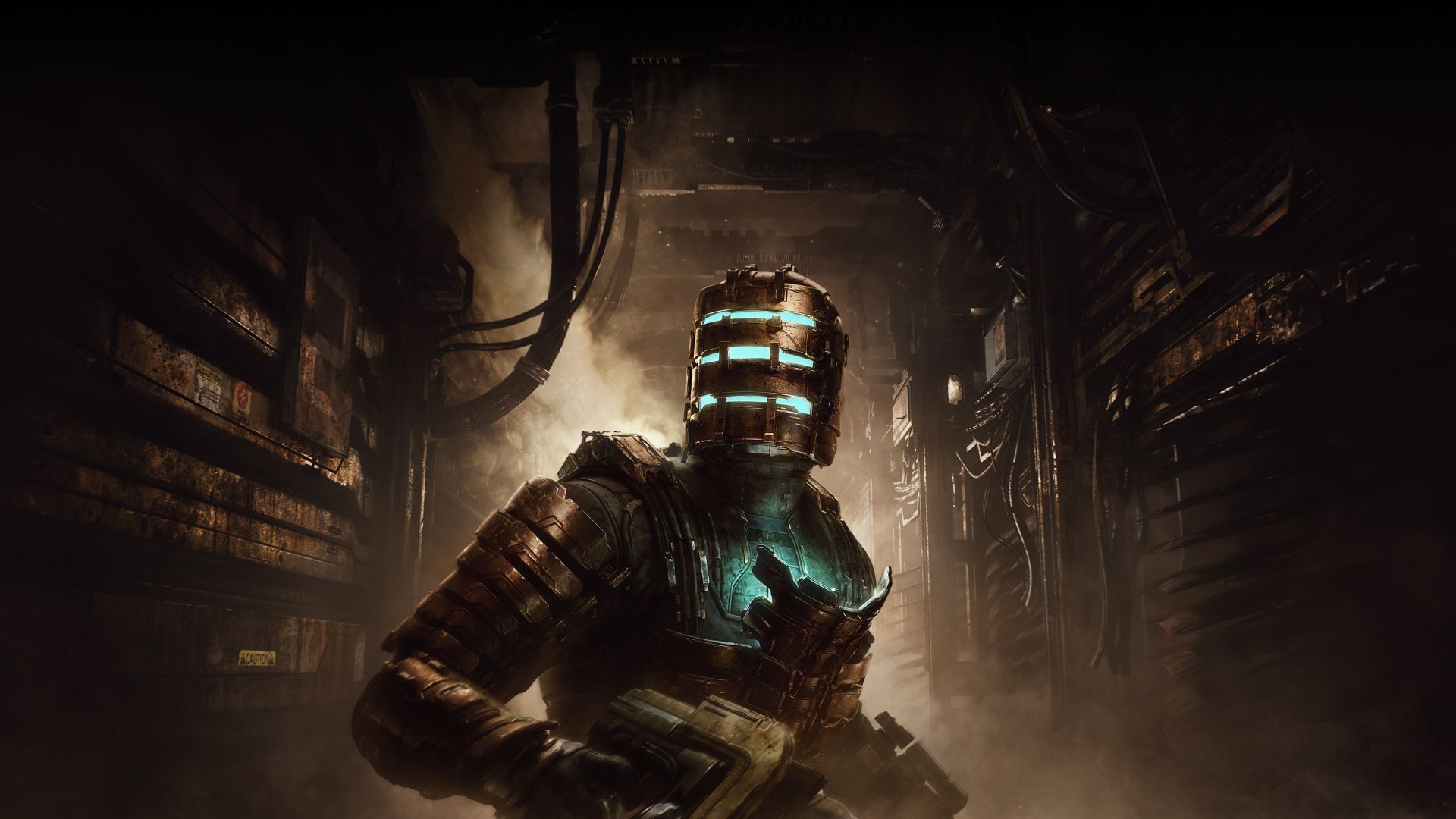
Dead Space is renowned for its immersive diegetic UI, where interface elements exist within the game world and are perceivable by both the player and the protagonist, Isaac Clarke.

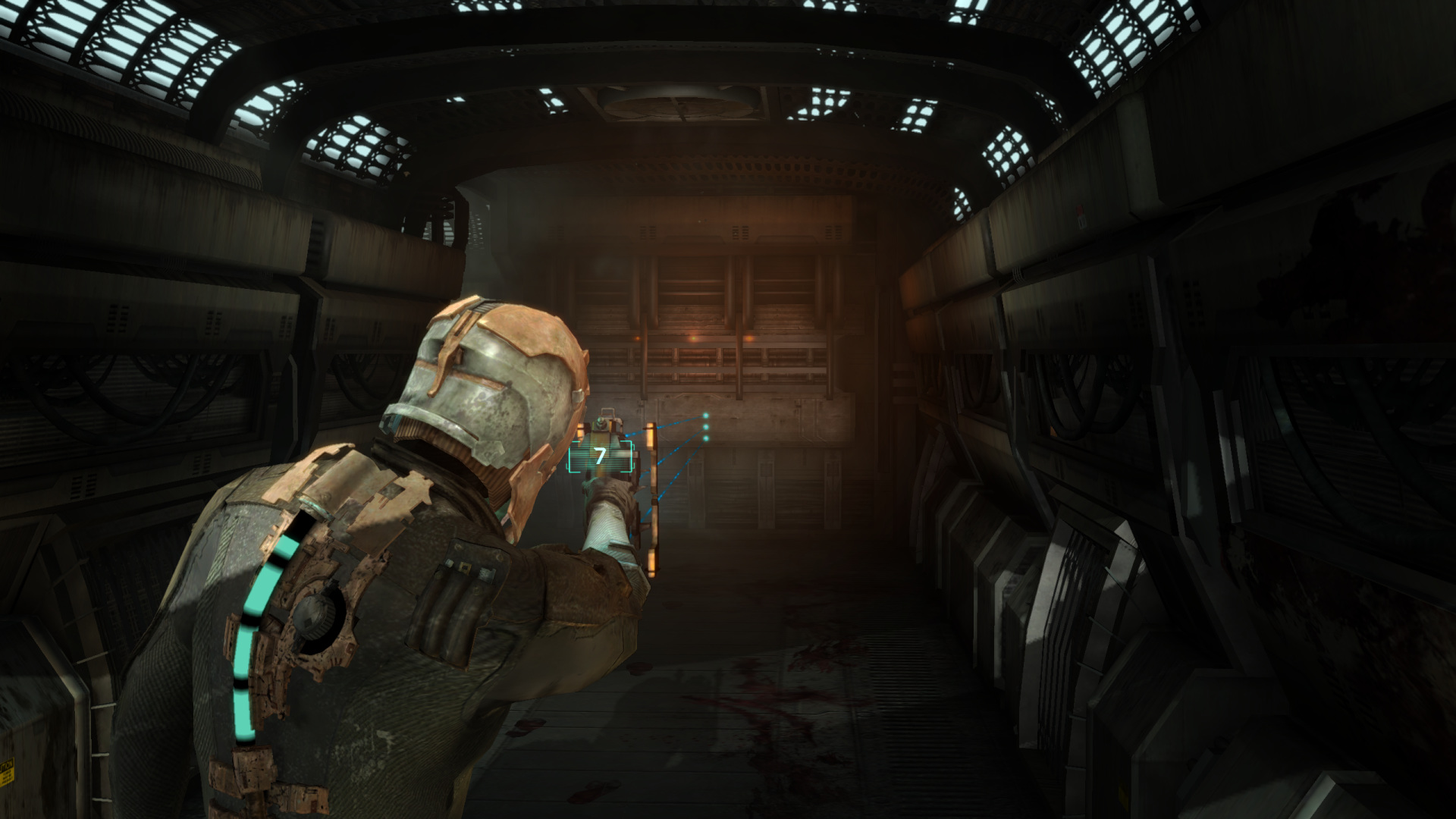
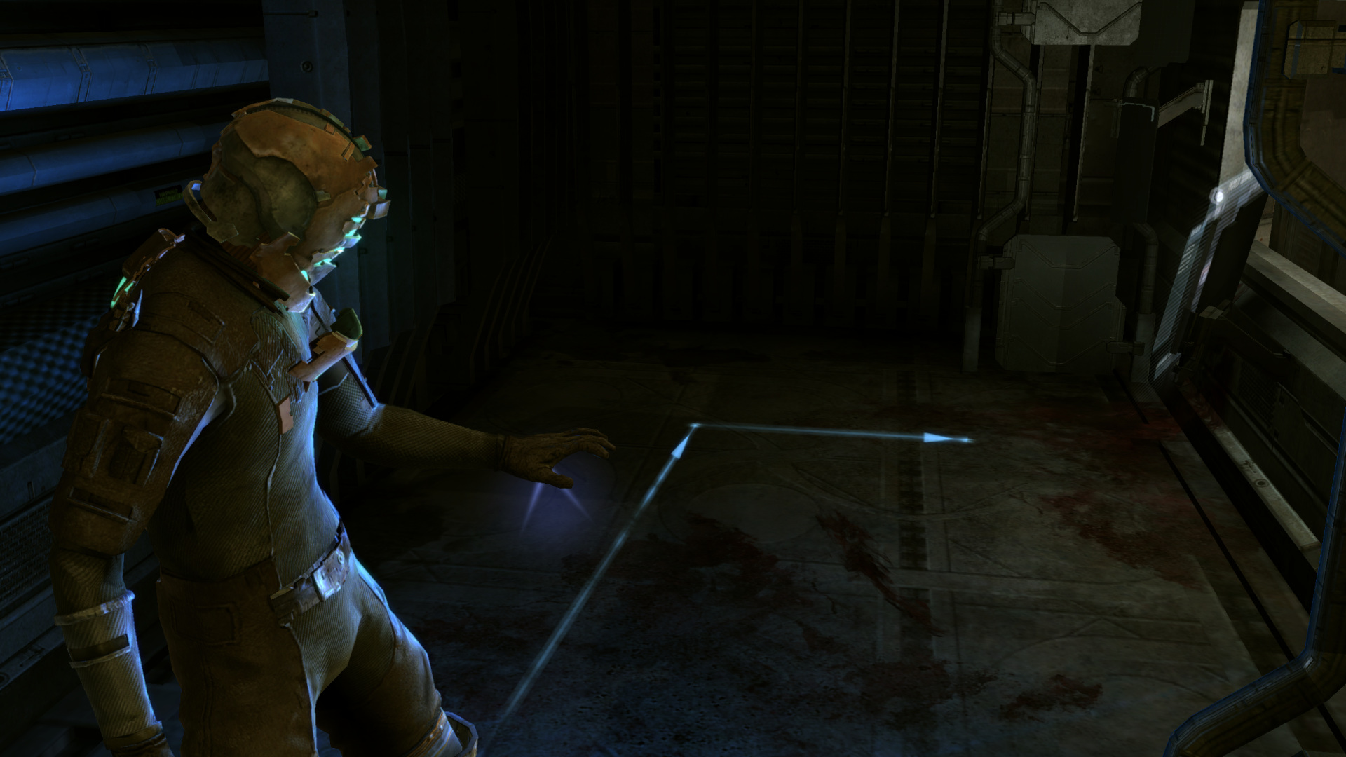
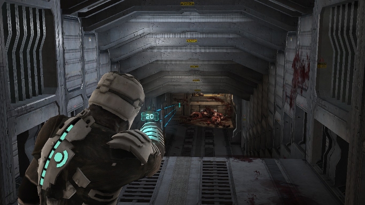
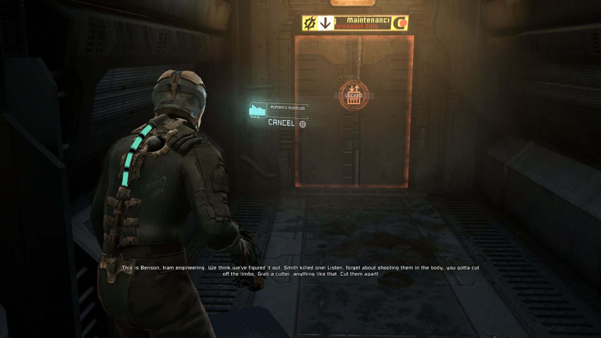
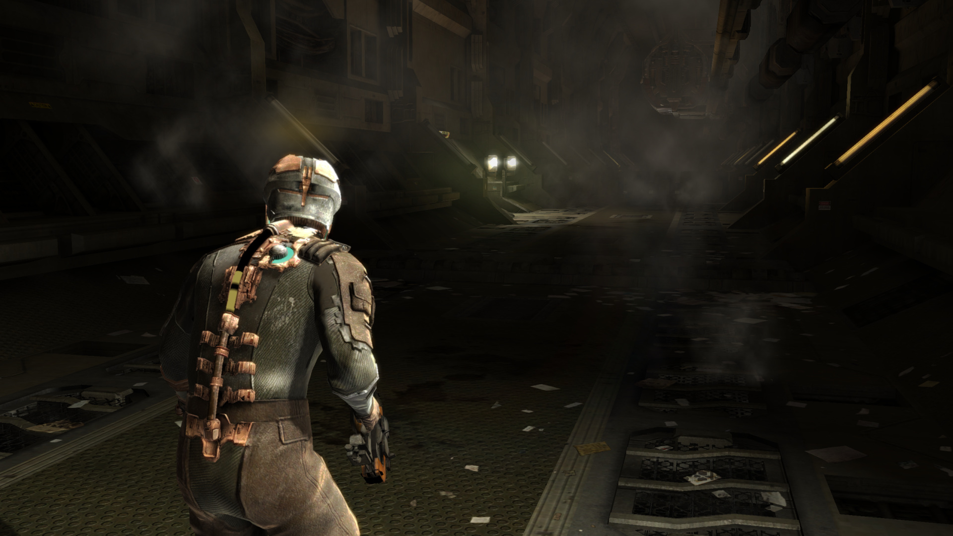
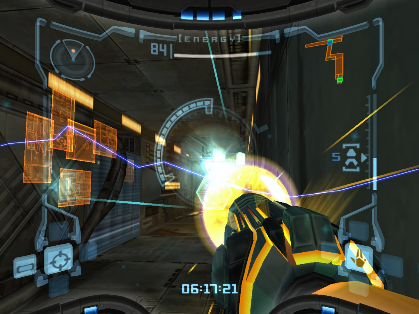
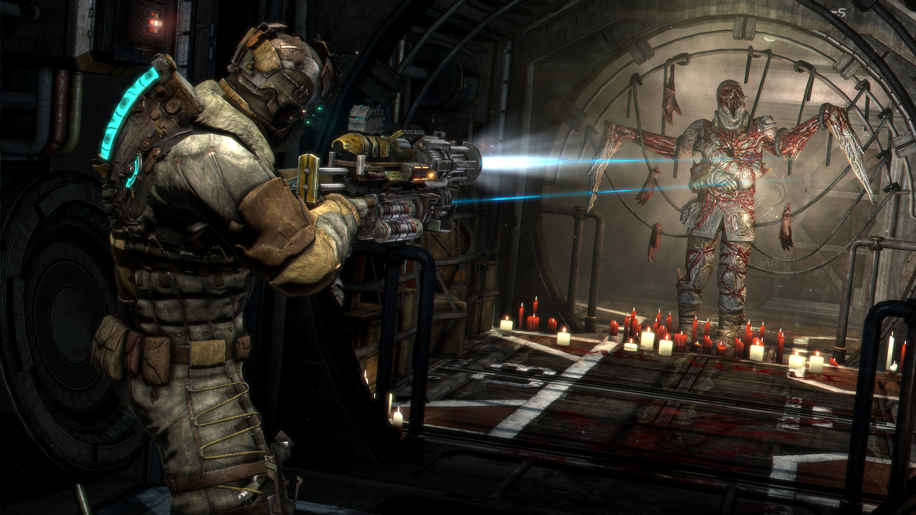
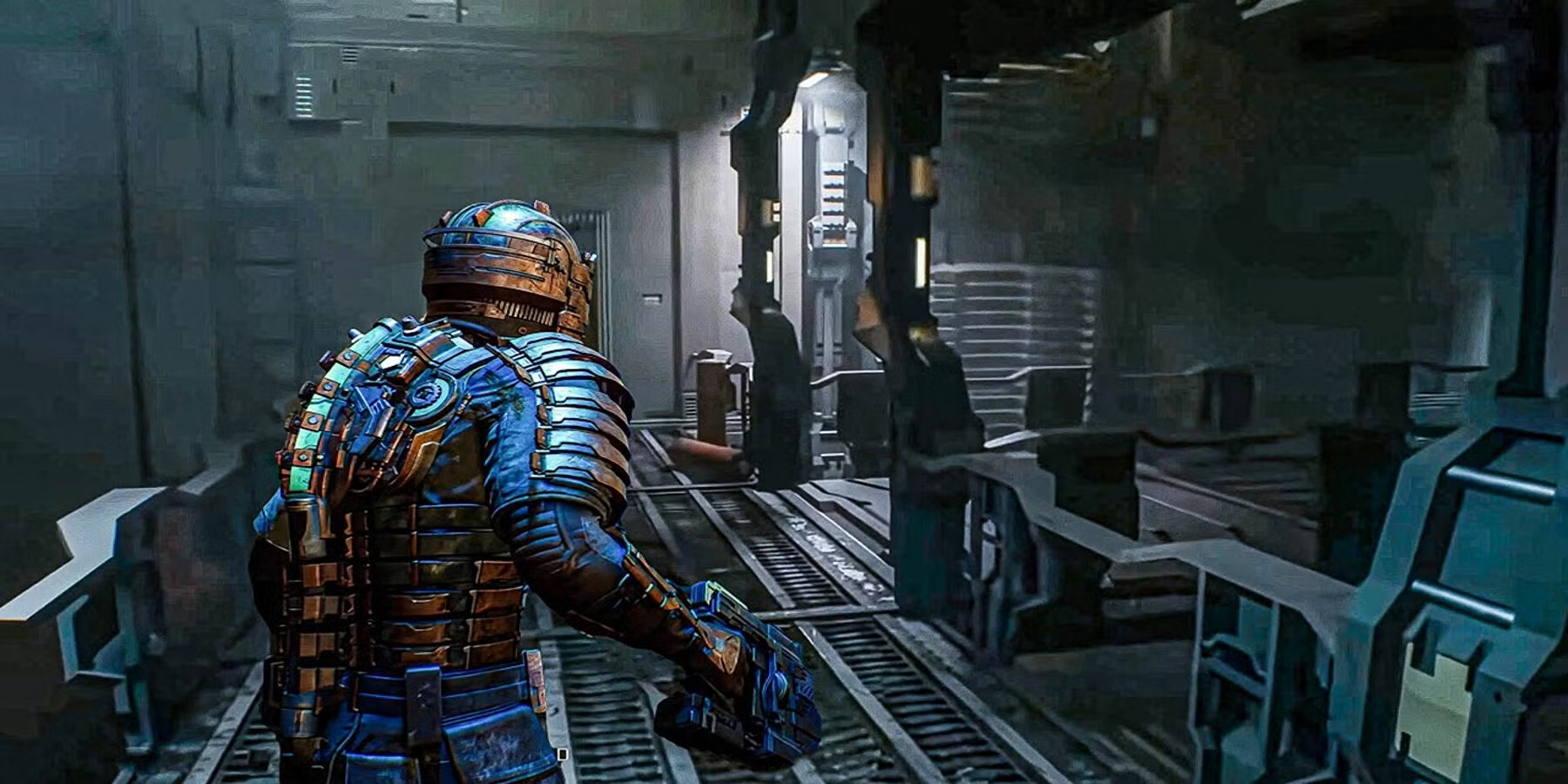
Dead Space is widely praised for its masterful use of diegetic UI because it seamlessly integrates gameplay information directly into the world, maintaining immersion and enhancing the horror experience. The health bar is embedded into the protagonist's suit spine, ammo counts appear as holograms projected from weapons, and objective markers are projected onto the floor from the character’s glove.

all designed as in-world elements rather than overlaid HUDs. This approach keeps players grounded in the universe, removing the typical disconnect between player and character. It also reinforces the game's themes of isolation and realism, as there’s no external interface breaking the fourth wall. These choices make the gameplay feel more intense and personal, while also influencing modern UI design in sci-fi and horror games.

what is diegetic about Dead Space?

HEALTH AND STATUS
The Resource Integration Gear (RIG) in Dead Space is a prime example of diegetic UI design, with health and stasis meters integrated into the protagonist Isaac's body. The health meter is a glowing, segmented bar along his spine, changing color and intensity based on health, while the stasis module indicates remaining charge. Both are physically part of the game world, enhancing immersion and aligning gameplay mechanics with in-universe technology.
Holographic Projections
In Dead Space, inventory and navigation are managed through holographic projections from Isaac's suit, keeping everything in-world. This spatial UI approach eliminates traditional HUDs, with objectives also shown as in-game holograms, enhancing immersion and realism.
Weapon Interfaces
In Dead Space, each weapon has an integrated UI, with ammo counts displayed on the weapon itself, removing the need for floating HUD numbers. Precision laser sights project directly from the weapons, offering real-time targeting feedback and enhancing spatial accuracy, all while keeping the player immersed in the game world.
In Dead Space, interactions are framed through physical in-world interfaces, like Save Stations and Upgrade Benches, which Isaac must approach to save or upgrade. This design replaces traditional menus, promoting spatial exploration and narrative continuity. Similarly, door panels and control consoles are interactive elements with responsive feedback, ensuring immersion and a seamless experience.
Environmental Interactions
No items found.

A micro timeline of
Dead Space

How the game’s UI has evolved over time, inspired by earlier works
and how it influenced later games

Metroid Prime - 2002
Introduced visor-based HUDs that mimicked looking through a helmet, with scan overlays, damage flicker, and environmental interaction within the HUD.
An early take on diegetic UI — the HUD was still traditional, but designed as if part of the world. Set the stage for more immersive interfaces in sci-fi games.
Dead Space - 2008
Groundbreaking diegetic UI — health and stasis bars integrated into Isaac’s suit (RIG), inventory and objectives as 3D holograms, weapon ammo displayed on the guns themselves.

First truly mainstream game to commit entirely to diegetic UI. No HUD. No health bar. Everything exists in the world.
This was a huge leap forward. The design philosophy removed traditional HUDs entirely, making the UI part of the world. It was immersive and risky — since players could be attacked even while checking inventory.
Dead Space 2 - 2011
Refined UI elements with better readability and feedback. Enhanced inventory UI, clearer holograms, subtle improvements in RIG animation. Introduced more fluid transitions between UI and gameplay.
The sequel improved usability without compromising immersion. More complex environments required better visual clarity, especially during action-heavy segments. Also introduced more cinematic storytelling moments — but UI remained diegetic.
Dead Space 3 - 2013
Diegetic UI vs. co-op design. The addition of multiplayer changed how UI had to function, balancing immersion with practical needs. Introduced universal crafting benches, slightly more intrusive UI prompts.
This is where the purity of diegetic UI began to bend. Co-op mechanics meant both players had to access and see certain elements, so UI had to become more visible, and in some cases, drifted toward traditional game UI methods.
Alien: Isolation - 2014
Minimal UI, retro-futuristic analog design, and in-world interaction panels. Used blinking lights, CRT monitors, and audio cues for navigation.
Built on Dead Space’s foundation but leaned more into 1970s sci-fi aesthetics. No ammo counters or glowing markers — the player had to interpret the environment.
The Last of Us Part II - 2020
While not fully diegetic, the UI is deeply integrated into character animations, like crafting, healing, or checking the map.
Shows how diegetic principles have influenced more grounded, cinematic games. The boundary between gameplay and UI is blurred through fluid animation.
The Callisto Protocol - 2022
Created by Dead Space devs. Modern spiritual successor. Includes health bars on the neck, holographic menus, and immersive audio/video logs.
More advanced visual effects, but design DNA is unmistakably Dead Space. The UI feels like a continuation — just more cinematic and brutal.

Why it worked

Enhanced Immersion

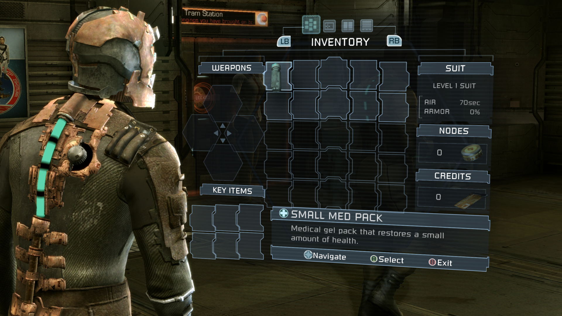
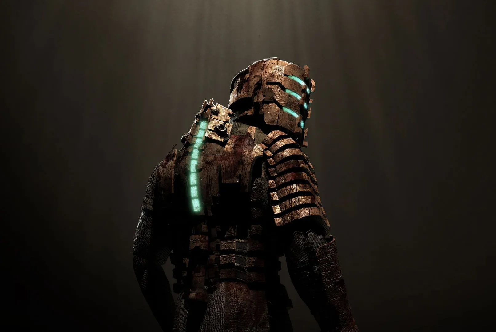
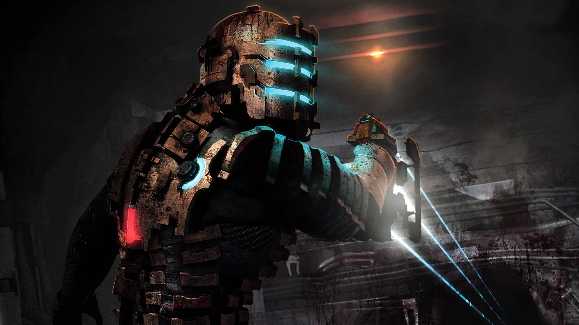
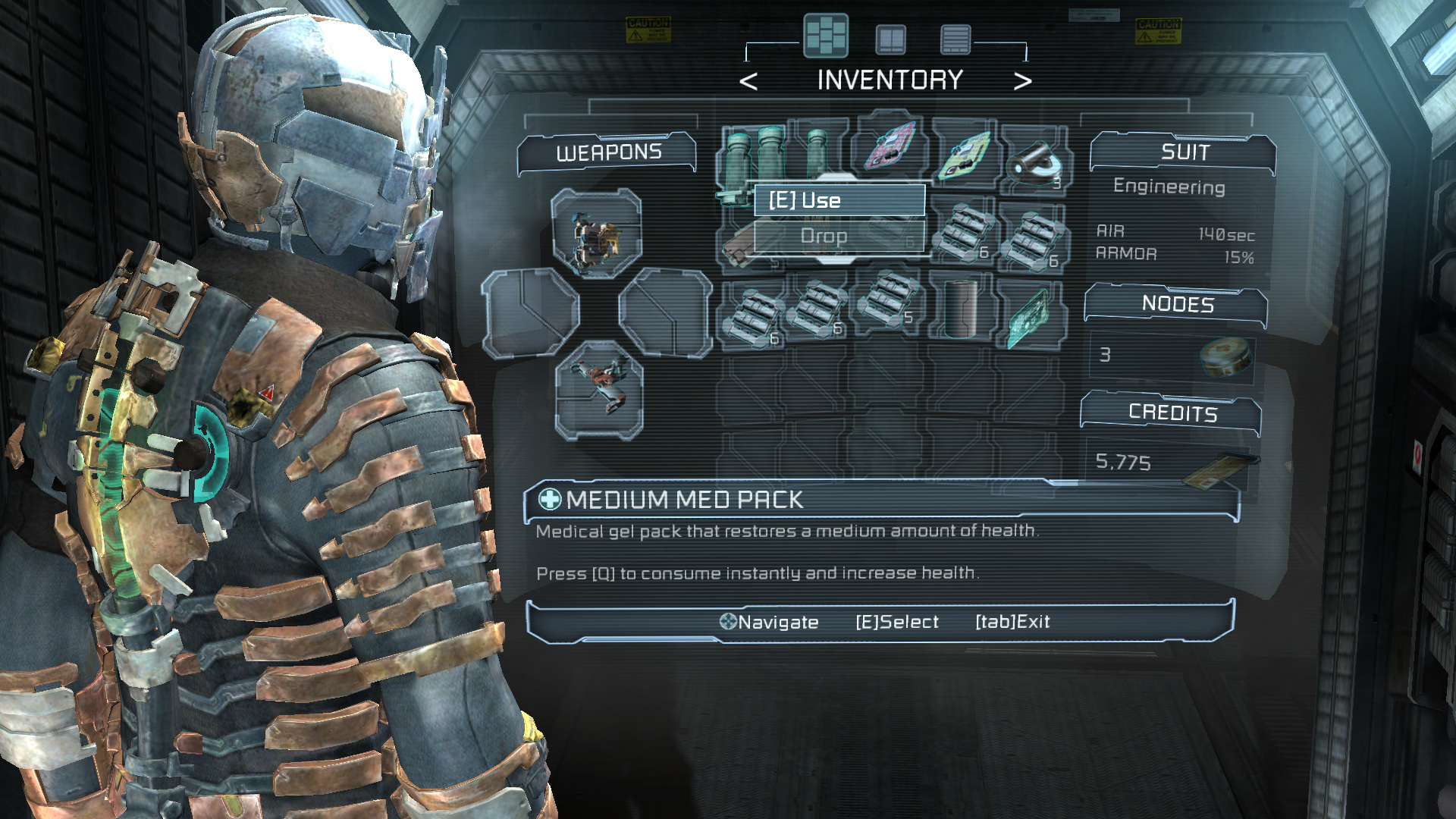
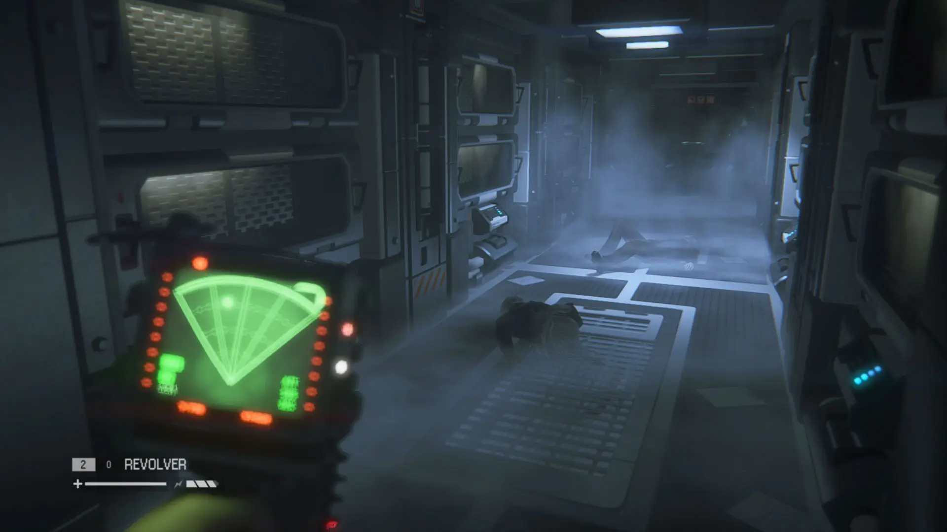
Dead Space redefines immersion with its fully diegetic UI, embedding all player information within the game world. Health is shown on Isaac's RIG suit, stasis on his shoulder, and inventory as a real-time hologram—visible to enemies during use. This design grounds players in the world, making every interaction feel immediate and real. As Lead UI Designer Dino Ignacio said, "We were not just diegetic by design; we were diegetic by implementation."

Concistant
DESIGN LANGUAGE

Dead Space maintains immersion with a consistent, color-coded UI: blue for accessibility and red for danger, all integrated into the environment without overlays. Interactive elements are always at a consistent height, making them easy to locate. This design strengthens immersion, reduces cognitive load, and supports the player's flow state.4o

Narrative Integration

Dead Space uses its UI as a storytelling tool, embedding every element within the world of the USG Ishimura. The RIG suit's design reflects Isaac's role as an engineer, not a soldier, and the ship's holographic interfaces match its technological setting. Audio logs and holograms deliver exposition while blending seamlessly into the game's universe, making the UI a narrative device that enhances immersion.

Next Study